These are the dog days of the NBA summer.
There isn't much to talk about. There's been inactivity on all fronts for the Houston Rockets. Even the most stalwart fans of the team are likely to allow their minds to wander.
Here at SpaceCityScoop, we're no exception. We may be thinking about the Rockets, but our thoughts are, at times, decidedly non-basketball related.
For example: isn't it time for the Rockets to get some new digs?
Houston Rockets need a rebrand
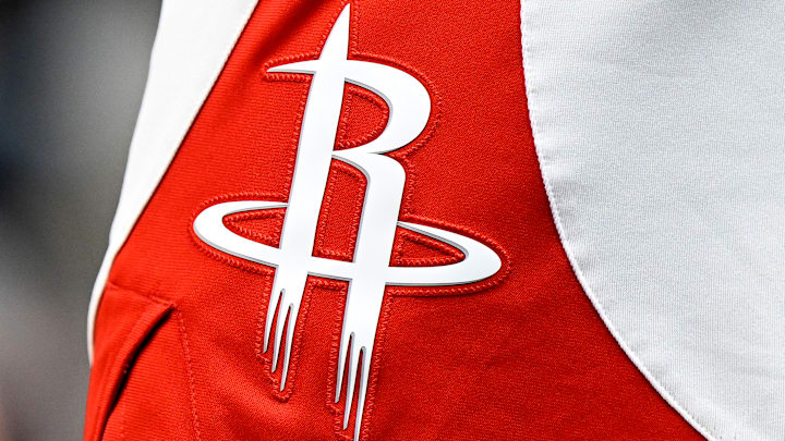
Full disclosure: the author of this article never really bought into the current design.
(I was talking to a friend about the logo once. Why does the R look like it's bleeding? He said it was a rocket taking off.
Good point, I said. Still, it looks like it's bleeding. Tell me I'm wrong.)
Moreover, the white, red, and black motif is...uninspired? Boring? It's not bad, per se. During the Harden era, it made the Rockets feel formidable. They weren't concerned with aesthetics. Something about the Rockets' businesslike color scheme worked in tandem with their analytic-heavy, bludgeoning brand of basketball.
The Harden era is over. The Rockets don't play that way anymore. This is a roster full of young guys with, as the young guys say, drip (?). Someone my age might say "swag".
What design would suit the new roster?
Houston Rockets will have options
There is a healthy appetite to return to the ketchup-and-mustard (see what I did there?).
There's an obvious appeal in that move. The Rockets won back-to-back titles in the 90s donning the condiment-inspired uniforms. A design that superimposes that color scheme over modern fonts and designs could make for a cool jersey.
There's an easier solution - commit to the Dunkstronaut full-time. It's a new logo and a new jersey for a new era. That's how we're leaning. Yes, we realize that the astronaut isn't a Rocket. There's some thematic inconsistency there:
Perhaps it would be more productive to think about something else.
